I want to focus this post on comparing and contrasting Victorian advertisements and graphic design in relation to the advertisements today. I learned from the reading that advertisements first appeared in great abundance during the Victorian era. This was due to the proliferation of mass communications media that were made more available to the general public as production and demand for reading material inceased. Social, political, economic, and technological changes ensured that this brought on advancements that produced greater wealth and literacy in the general public. People had more money to purchase products that were mass produced, making them cheaper and more accessible to the general public. Companies began competing against each other to gain the favor of the larger consumer market, hoping to convince them to purchase their products. Ads, thus, became abundant in sinage posted throughout cities and in editorials and newspapers.
 |
Victorian era postacard ad for Cornish & Co. Source: xroads.virginia.edu
|
Meggs writes in
History of Graphic Design that "The Spectacle of posters covering public spaces gave a new, dynamic visual element to urban living that contrasted with the traditional visual art experience of the art gallery. (p. 168). Unlike today, the Victorians enjoyed looking at ads more. Due to the slower pace and lifestyle of the Victorian era, people back then simply had more leisurely time to explore and enjoy the various ads and posters, as these were very new sights created by the newest innovations in technology. Graphics, which use to be just black and white, started to be printed in multiple colors due by innovations in chromolithography, creating a novel experience for the viewer.
It was interesting to read also that "...Victorian advertising pages were created with little concern for a total design." (p. 172). I think that design might not have been as important back then because the designers knew that people would actually stop, look at the poster, and engage in the message and intricate details. Unlike today where there are numerous ads competing for the viewers attention and a bad design will cause the user to ignore it, bad design in the Victorian period did not cause users to disregard ads. So Victorian graphic designers for ads simply just got away with poor design!
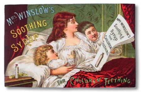
Meggs writes that "Frequently, an engraved illustration would have type set above or below it, and often engravers adopted the prevalent practice of chromolithography, superimposing lettering on top of a pictorial image." (p. 172). Looking at the ad below of Mrs. Winslow's Soothing Syrup, we can see an example of the text superimposed right on top of the colorful graphics causing it to be hard to read. The text on the bottom is especially not visible because it clashes with the strong red color of the blanket. A viewer today would disregard this ad due to the difficulty in making out the message. We don't have time today to focus on ads. We'd simply move on to the next thing to look at. But back in the Victorian era, the viewer would find this ad interesting and will be willing to spend time to figure out what the ad wants to say.
 |
| Source: englishhistoryauthors.blogspot.com |
This group of ads below provides more examples of the nature of Victorian ad design. There is plenty of clutter and a viewer today will simply glance over all the ads below without spending time on any of them. There is too much to look at nothing really catches the eye. However, I think the Victorian reader would like to spend time looking at each ad carefully despite the clutter.
 |
| Source: meylah.com |
Meggs writes again that in Victorian ads, "Outlandish and fantasy lettering enjoyed great popularity, and many trademarks of the era reflect the Victorian love of ornamental complexity." (p. 175).
Here are examples I found on the Internet of this embellishment of lettering that we don't find common in ads of today's time:
 |
| Source: freevintagedigistamps.blogspot.com |
 |
| Source: pinterest.com |
 |
Source: midclassillustration.blogspot.com
|
Now let's take a look at the differences in design in the ads of today:
 |
| Source: gra2171rasterizers.wordpress.com |
 |
| Source: terryrybak.visualsociety.com |
 |
| Source: grist.org |
Unlike the ads in the Victorian era, ads today have strong bold letters, making the words easier to read and capturing the user's attention. The text does not clash with the image in the background. The design is much better, using more empty space so that it doesn't clutter the image. A short split second glance at these ads will allow the viewer to have enough time to figure out what they're advertising and the product and brand being advertised. Contrast this to the Victorian ad. Viewers back then will need to spend at least 5-10 seconds to have the message conveyed to them.


No comments:
Post a Comment