A major theme I discovered in my reading for Module 3, especially in chapters 7 and 8 of Megg's History of Graphics Design, is the evolution of typographic fonts throughout time. Before reading this module, I've never put much thought into how fonts were developed and the intentions behind the typographic artists in their design. I learned that there is actually a lot of thought put into fonts, ranging from the use of mathematical symmetry to increase functionality (e.g. readability, spacing, etc.), to ornamentation and style (e.g. serifs, curves, stylish elements, etc.). It's simply amazing how like any other art and creative expression, fonts are just another medium of this.
Also just as how paintings have evolved through history into many different styles (e.g. impressionism, cubism, surrealism, realism, etc.), fonts also went through a similar process of evolution. For example, we see the rococo era usher in fonts that emanate the style of the time. We see its floral and intricate "S- and C- curves with scrollwork, tracery, and plant forms derived from nature classical and oriental art, and medieval sources." (Meggs, p. 122-123).
Contrasted to the rococo style was a font that existed opposite range in design and functionality. Instead of stylistic and "fancy" elements, we see Caslon's type designs not at all fashionable or innovative. Megg describes his font as having "outstanding legibility and study texture that made them 'comfortable' and 'friendly to the eye.'" (Meggs, 127).
After the reading I decided to browse through all the different fonts stored in my Adobe Photoshop software and saw many of the same fonts covered in my reading appearing in the list. From Baskerville to Garamond, I can now recall what I learned about each font's history, development, and design elements. I now am equipped to undertand why each of these fonts exist, what they can be used for, and apply it to my publishing works. I'm glad that I now don't need to choose fonts randomly as a result of my better sense and understanding of each font's stylistic and functional components.
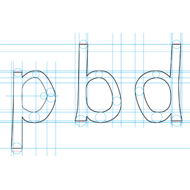
I decided to explore more about how fonts are developed today by doing a Google search and came across this article in the Scientific American about how a font was designed to help dyslexics read. This font, called "Dyslexie" was designed by a graphic designer named Christian Boer from the Netherlands (by the way, is a country with a history of font development). The purpose of the font is to "decrease the number of errors made by dyslexics while reading." For example, the Boer tweaked how the "d" and "b" letters appear to make them more recognizable, as dyslexics often have a hard time distinguishing between these two letters due to their similarity in appearance Another technique used was to enlarge the openings of the "a" and "c" letters and enlarging the tails of "g" and "y." He claimed to have spent roughly 15 hours for each letter he developed. And it appears his work paid off, as participants from a University of Twente study commented that the font allowed them to read with improved accuracy and it took them longer before they got tired reading.
It's amazing how not only can font design be used for stylistic and practical purposes, but it can also help people who suffer from conditions perform better. All this makes me want to further explore the subject of font design and be better equipped at selecting fonts with the right intention and use for my graphics design work.
Also just as how paintings have evolved through history into many different styles (e.g. impressionism, cubism, surrealism, realism, etc.), fonts also went through a similar process of evolution. For example, we see the rococo era usher in fonts that emanate the style of the time. We see its floral and intricate "S- and C- curves with scrollwork, tracery, and plant forms derived from nature classical and oriental art, and medieval sources." (Meggs, p. 122-123).
Contrasted to the rococo style was a font that existed opposite range in design and functionality. Instead of stylistic and "fancy" elements, we see Caslon's type designs not at all fashionable or innovative. Megg describes his font as having "outstanding legibility and study texture that made them 'comfortable' and 'friendly to the eye.'" (Meggs, 127).
 |
| Caslon font, source: http://digitalarts.uconn.edu/fall2012/wp-content/uploads/2012/08/Caslon-Font-Sheet.gif |
After the reading I decided to browse through all the different fonts stored in my Adobe Photoshop software and saw many of the same fonts covered in my reading appearing in the list. From Baskerville to Garamond, I can now recall what I learned about each font's history, development, and design elements. I now am equipped to undertand why each of these fonts exist, what they can be used for, and apply it to my publishing works. I'm glad that I now don't need to choose fonts randomly as a result of my better sense and understanding of each font's stylistic and functional components.
I decided to explore more about how fonts are developed today by doing a Google search and came across this article in the Scientific American about how a font was designed to help dyslexics read. This font, called "Dyslexie" was designed by a graphic designer named Christian Boer from the Netherlands (by the way, is a country with a history of font development). The purpose of the font is to "decrease the number of errors made by dyslexics while reading." For example, the Boer tweaked how the "d" and "b" letters appear to make them more recognizable, as dyslexics often have a hard time distinguishing between these two letters due to their similarity in appearance Another technique used was to enlarge the openings of the "a" and "c" letters and enlarging the tails of "g" and "y." He claimed to have spent roughly 15 hours for each letter he developed. And it appears his work paid off, as participants from a University of Twente study commented that the font allowed them to read with improved accuracy and it took them longer before they got tired reading.
 |
| Dyslexie font, source: http://www.scientificamerican.com/article.cfm?id=new-font-helps-dyslexics-read |
No comments:
Post a Comment