Tuesday, October 30, 2012

Frank Lloyd Wright at the Forefront of 20th Century Design

I must say I love Frank Llyod Wright and his design the same way Meggs does. On a recent trip to Chicago for business last week, I was reminded of his influence on architecture and design. Two years ago, on another trip to Chicago, I was fortunate enough to take a tour of his home and design studio in Oak, Park IL. I had very little knowledge of Wright and his influence on design previously. The tour provided a window into how Wright's impact on the world, and reading chapter 12 of Megg's History of Graphic Design helped me to connect Wright to the prevailing movements of design during the late nineteenth and early twentieth century. In fact, I liked how Meggs put Frank Lloyd Wright at the beginning of chapter 12, entitled "The Genesis of Twentieth Century Design." I believe this means that Meggs has a special place for Wright for his influence on twentieth century design and I'd even suggest that she believes he was one of the prominent leaders at the forefront of the new movement bridging the way from art nouveau to modern design of this past century. Meggs writing that "At the turn of the century he was at the forefront of the emerging modern movement" on page 233 pretty much sums it up!

One of the aspects I love about Wright's design is that it was one of the first design movements that had his origin straight from the United States. Unlike other design movements like art nouveau that had its origins in Europe and Asia, Wright's design principals was purely American. (Although he did still draw some of his inspiration from the French rationalist writings of Eugene Viollet-le-Duc, the British Arts and Crafts movement, Japanese architecture, and pre-Columbian art, most would say that Wright's style is still uniquely American). His style later spread across the globe to Europe and started a new era of design where America became the new origin of design influence. Wright caused others around the world to draw inspiration from America, placing us as leaders in the design world.

Wright design was actually very radical during his time. He rejected historicism in favor of "organic architecture." He placed direct emphasis on the interior spaces of buildings. He had this unique way of combining his buildings with the surrounding landscape. Since he hailed from the flat prairies of the midwest, it would then make sense that he would like using very flat long horizontal lines that resembled the environment where his buildings existed. He loved space and you can see this in the spacious interiors of his buildings. Wright also had a deep love and knowledge of nature, probably one of the first to lead the cause for environmentally friendly buildings. He especially placed a lot of attention to the lighting, heating and climate control of the buildings he designed. Wright once said that "The good building makes the landscape more beautiful than it was before the building was built.” This was the start of the "Organic Architecture" movement.

Below are examples of his style of architecture where you can see the prevailing long horizontal lines of his "Prairie House" style.

Photo of Frank Lloyd Wright's Studio I took on a tour in Oak Park, IL in 2010. Notice the long horizontal and vertical lines.
Photo of a house in Oak Park, IL that I took exhibiting Frank Lloyd Write's Prairie House architectural style
No, this is not in the mid-West. This Prairie House style home is found in San Jose, CA (source: http://photos.mercurynews.com/2012/07/20/prairie-style-homes-still-turning-heads/#2)
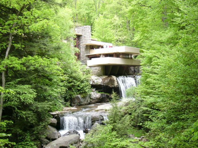
Fallingwater, by Wright. Source: http://upload.wikimedia.org/wikipedia/commons/f/f6/FallingwaterWright.jpg


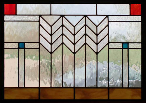
Wright used many mathematical concepts in his design and architecture. Of course, being educated in engineering at the University of Wisconsin, Madison helped. (Although he had to drop out to pursue a career in architecture). We see many of his design containing geometric shapes, often repeating lines and in both symmetric and asymmetric patterns. On the tour in Oak Park, I heard this was because of his fascination with the wood blocks used to educate children in mathematical concepts in German Kindergartens. Many of these geometric patterns were apparent in his print and architectural designs. Some of them were simple, but others were extremely complex with many repeating patterns. Below are some examples of his intricate design patterns found in both print and in his architecture.

Source: http://www.curbly.com/uploads/photos/0000/0001/0392/Frank-Lloyd-Wright_large.jpg

Source: http://www.scottishstainedglass.com/wp-content/uploads/2010/11/frank-lloyd-wright-stained-glass-designs-large.jpg
Source: http://frank-lloyd-wright.visit-chicago-illinois.com/frank-lloyd-wright-robie-livingroom.jpg
Source: http://images.monstermarketplace.com/jewelry-gifts-and-home-accessories/frank-lloyd-wright-rug-designs-coasters-set-283x288.jpg
Wright later worked under Sullivan, which was Chicago's most progressive architect at that time, who had strong influence on him. At the age of 26, Wright begin his own practice where he designed numerous homes, buildings, furniture, and interiors. Some of Wrights most famously known styles include the Prairie House Style, textile block houses often found in California, Mature Organic style, and Usonian Houses.

I would one day love to own a Frank Lloyd Wright inspired home emphasizing the surround environment, with design-focused interiors, and repeating patterns.

Sources:
Megg's History of Graphics Design
http://en.wikipedia.org/wiki/Frank_Lloyd_Wright
http://www.pbs.org/flw/legacy/essay1.html

Tuesday, October 23, 2012

Victorian Advertisements versus Ads of Today

I want to focus this post on comparing and contrasting Victorian advertisements and graphic design in relation to the advertisements today. I learned from the reading that advertisements first appeared in great abundance during the Victorian era. This was due to the proliferation of mass communications media that were made more available to the general public as production and demand for reading material inceased. Social, political, economic, and technological changes ensured that this brought on advancements that produced greater wealth and literacy in the general public. People had more money to purchase products that were mass produced, making them cheaper and more accessible to the general public.  Companies began competing against each other to gain the favor of the larger consumer market, hoping to convince them to purchase their products. Ads, thus, became abundant in sinage  posted throughout cities and in editorials and newspapers.

Victorian era postacard ad for Cornish & Co. Source: xroads.virginia.edu


Meggs writes in History of Graphic Design that "The Spectacle of posters covering public spaces gave a new, dynamic visual element to urban living that contrasted with the traditional visual art experience of the art gallery. (p. 168). Unlike today, the Victorians enjoyed looking at ads more. Due to the slower pace and lifestyle of the Victorian era, people back then simply had more leisurely time to explore and enjoy the various ads and posters, as these were very new sights created by the newest innovations in technology. Graphics, which use to be just black and white, started to be printed in multiple colors due by innovations in chromolithography, creating a novel experience for the viewer.

It was interesting to read also that "...Victorian advertising pages were created with little concern for a total design." (p. 172). I think that design might not have been as important back then because the designers knew that people would actually stop, look at the poster, and engage in the message and intricate details. Unlike today where there are numerous ads competing for the viewers attention and a bad design will cause the user to ignore it, bad design in the Victorian period did not cause users to disregard ads. So Victorian graphic designers for ads simply just got away with poor design!

Meggs writes that "Frequently, an engraved illustration would have type set above or below it, and often engravers adopted the prevalent practice of chromolithography, superimposing lettering on top of a pictorial image." (p. 172). Looking at the ad below of Mrs. Winslow's Soothing Syrup, we can see an example of the text superimposed right on top of the colorful graphics causing it to be hard to read. The text on the bottom is especially not visible because it clashes with the strong red color of the blanket. A viewer today would disregard this ad due to the difficulty in making out the message. We don't have time today to focus on ads. We'd simply move on to the next thing to look at. But back in the Victorian era, the viewer would find this ad interesting and will be willing to spend time to figure out what the ad wants to say.

Source: englishhistoryauthors.blogspot.com
This group of ads below provides more examples of the nature of Victorian ad design. There is plenty of clutter and a viewer today will simply glance over all the ads below without spending time on any of them. There is too much to look at nothing really catches the eye. However, I think the Victorian reader would like to spend time looking at each ad carefully despite the clutter.

Source: meylah.com

Meggs writes again that in Victorian ads, "Outlandish and fantasy lettering enjoyed great popularity, and many trademarks of the era reflect the Victorian love of ornamental complexity." (p. 175).

Here are examples I found on the Internet of this embellishment of lettering that we don't find common in ads of today's time:

Source: freevintagedigistamps.blogspot.com
Source: pinterest.com

Source: midclassillustration.blogspot.com


Now let's take a look at the differences in design in the ads of today:

Source: gra2171rasterizers.wordpress.com

Source: terryrybak.visualsociety.com

Source: grist.org

Unlike the ads in the Victorian era, ads today have strong bold letters, making the words easier to read and capturing the user's attention. The text does not clash with the image in the background. The design is much better, using more empty space so that it doesn't clutter the image. A short split second glance at these ads will allow the viewer to have enough time to figure out what they're advertising and the product and brand being advertised. Contrast this to the Victorian ad. Viewers back then will need to spend at least 5-10 seconds to have the message conveyed to them.

Tuesday, October 16, 2012

Module 3: Fonts are Fontastic!

A major theme I discovered in my reading for Module 3, especially in chapters 7 and 8 of Megg's History of Graphics Design, is the evolution of typographic fonts throughout time. Before reading this module, I've never put much thought into how fonts were developed and the intentions behind the typographic artists in their design. I learned that there is actually a lot of thought put into fonts, ranging from the use of mathematical symmetry to increase functionality (e.g. readability, spacing, etc.), to ornamentation and style (e.g. serifs, curves, stylish elements, etc.). It's simply amazing how like any other art and creative expression, fonts are just another medium of this.

Also just as how paintings have evolved through history into many different styles (e.g. impressionism, cubism, surrealism, realism, etc.), fonts also went through a similar process of evolution. For example, we see the rococo era usher in fonts that emanate the style of the time. We see its floral and intricate "S- and C- curves with scrollwork, tracery, and plant forms derived from nature classical and oriental art, and medieval sources." (Meggs, p. 122-123).

Contrasted to the rococo style was a font that existed opposite range in design and functionality. Instead of stylistic and "fancy" elements, we see Caslon's type designs not at all fashionable or innovative. Megg describes his font as having "outstanding legibility and study texture that made them 'comfortable' and 'friendly to the eye.'" (Meggs, 127).

Caslon font, source: http://digitalarts.uconn.edu/fall2012/wp-content/uploads/2012/08/Caslon-Font-Sheet.gif

After the reading I decided to browse through all the different fonts stored in my Adobe Photoshop software and saw many of the same fonts covered in my reading appearing in the list. From Baskerville to Garamond, I can now recall what I learned about each font's history, development, and design elements. I now am equipped to undertand why each of these fonts exist, what they can be used for, and apply it to my publishing works. I'm glad that I now don't need to choose fonts randomly as a result of my better sense and understanding of each font's stylistic and functional components.

I decided to explore more about how fonts are developed today by doing a Google search and came across this article in the Scientific American about how a font was designed to help dyslexics read. This font, called "Dyslexie" was designed by a graphic designer named Christian Boer from the Netherlands  (by the way, is a country with a history of font development). The purpose of the font is to "decrease the number of errors made by dyslexics while reading." For example, the Boer tweaked how the "d" and "b" letters appear to make them more recognizable, as dyslexics often have a hard time distinguishing between these two letters due to their similarity in appearance  Another technique used was to enlarge the openings of the "a" and "c" letters and enlarging the tails of "g" and "y." He claimed to have spent roughly 15 hours for each letter he developed. And it appears his work paid off, as participants from a University of Twente study commented that the font allowed them to read with improved accuracy and it took them longer before they got tired reading.
Dyslexie font, source: http://www.scientificamerican.com/article.cfm?id=new-font-helps-dyslexics-read
It's amazing how not only can font design be used for stylistic and practical purposes, but it can also help people who suffer from conditions perform better. All this makes me want to further explore the subject of font design and be better equipped at selecting fonts with the right intention and use for my graphics design work.

Wednesday, October 10, 2012

Module 2: The Very First Graphic Designs

I didn't find it very difficult to choose the exploration topic for this week's field journey entry. Between the development of various alphabets, written languages, and illustrated manuscripts as forms of visual communications, the cave markings were the early graphics designs that interested me the most. These prehistoric petroglyphs were the earliest ever graphic designs that are still preserved today in various caves throughout the world. I got a chance to visit some of these caves in France during a trip I made in July for a friend's wedding.

Me standing in front of the entrance of Font-de-Gaume, cave in southern France containing paintings dating from around 17000 BC.
When I went to the Dordogne region in Southern France, I didn't think much of visiting the cave paintings, as I was more interested in the castles, food, and wine. But my friend convinced me to go two caves and told me of their historical significance. I've ready about the caves at Lascaux in my history textbooks, but never really explored prehistoric human markings in more detail. Because the caves at Lascaux were now closed to the public and only a replica exists for visits, we wanted to see the real deal. So We chose to visit a cave called Font-de-Gaume near Les Eyzies-de-Tayac-Sireuil. The cave contains one of the earliest examples of prehistoric polychrome cave paintings and engravings, dating back to around 17000 BC (during the MagdalĂ©nien period). These were really old graphics designs, the earliest I've ever seen live not reproduced in a textbook!

Artist depiction of Cro-Magnon artists painting in Font-de-Gaume, by Charles R. Knight. Source: http://en.wikipedia.org/wiki/File:Font-de-Gaume.jpg
The tour guide at the cave said there are 230 figures currently recorded in the cave, but possibly more that have not been discovered. They are images of 80 bison, around 40 horses, and more than 20 mammoths. These are polychrome paintings because they use multiple colors or various red tones and black. These images are considered to be one of the best examples of prehistoric cave paintings that are still open to visitors. And to connect this to what I learned in my reading, these are "pictographs" because they are pictures representing the actual things being depicted. In this case, various animals.

The second cave I visited was the famous Pech Merle cave also in Southern France. This cave is more than a mule long and contains numerous murals of that date from the Gravettian culture around 25000 to 16000 BC. The image that fascinated me the most were the cave paintings of the human hands. It almost looked like the artist placed their hand on the rock and "spray-painted" the outline of it.

Source: http://upload.wikimedia.org/wikipedia/commons/thumb/e/e6/Pech_Merle_main.jpg/429px-Pech_Merle_main.jpg

After visiting the caves, and reading the textbook, I decided to do a bit more exploration on my own about the purposes of these designs. The Wikipedia article on cave paintings tells us the exact purpose is still unknown. Megg's History of Graphic Design says that "these early pictures were made for survival and for utilitarian and ritual purposes." (p. 7). Other theories suggest that they were not decorations, but ways to communicate with others. Graphics designs is a form of visual communications, and perhaps, these earliest forms were used to communicate to both living and dead (as ceremonial or magical functions).

I also found a very interesting article recently that suggests some of these graphics may also be the earliest forms of animation. It's interesting that even prehistoric man can conjure up moving graphics! The example below shows that these images may have been created by "cartoon-like techniques to give the impression that wild beasts were trotting or running across cave walls."

Source: http://blogs.discovery.com/.a/6a00d8341bf67c53ef01630642ce83970d-pi
Wow! Who thought graphic design wouldn't be a part of a leisurely vacation in Southern France or such a fascinating part in the foundation of human history.

Sources:
http://en.wikipedia.org/wiki/Cave_painting
http://en.wikipedia.org/wiki/Font-de-Gaume
http://en.wikipedia.org/wiki/Pech_Merle
http://news.discovery.com/history/prehistoric-movies-120608.html

Tuesday, October 2, 2012

Module 1: First Impressions


I found it difficult to understand the usefulness of this exercise upon first impression. But I was soon proven wrong as I completed a visual study through each picture of Megg's History of Graphic Design text book. Studying the series of images gave me a better insight into the the concept of graphic design and its vast history that I could not obtained if someone had just explained it to me in mere words.

The history of graphic design has been captured since the prehistoric paintings deep in the cave of Lascaux to the digital media in web-based graphics accessed today from our desktop and mobile devises.  Browsing through the series of pictures made it evident to me that graphic design has been an expression of man since man first begin communicating. It's  amazing that graphic design is still being used commonly today. We see it everywhere - in ads, magazines, movie posters, company logos, and even on our clothes.

http://www.bradshawfoundation.com/lascaux/index.php


http://hellerbooks.com/docs/news.html


I've learned that graphic design is not only an art, in the sense that it is expression of creativity, but it is also a medium of practical communication used to convey the simplest statements. It has been found in a wide range of mediums, from simple typography in print to a brilliantly illustrated manuscript painted on a Renaissance tapestry. It's awesome to me that even the characters of text seen in this blog can be considered graphic design.

Simply put, I'm not just studying the history of graphic design, I'm studying the history of man and how we communicate. 

Browsing through the pictures also allowed me to see the various patterns and themes of graphic design expressed throughout time. Graphic design appears to have first started out as pictures, then pictures used to represent words. As man became more sophisticated, the pictures became symbols and illustrations began emerging and a sense of creative expression flourished. The different styles that emerged represented the essence of each particular culture that it came from. The repeating patterns found in Islamic graphic design, for example, expressed the infinite and consistant nature of God. Then we see it flourishing during the industrial revolution with the explosion of mass production. We were able to mass produce media like no other time in human history and this made graphics design easy to create and more accessible to the masses.

The history of graphic design will open the door for me to a better understanding of humanity. I'm super excited about what I will learn in this course as I dive deeper.