What makes a logo so effective? I think an effective logo is one that can express the essence of the organization well and is universal and immediate. The viewer does not need to think about it or figure it out. Once they see, they know what the organization represents. The feelings, emotions, vision, and mission of the organization is expressed in one single simple but compelling visual.
Ten out of the 12 above logos have blue in it. The only ones that don't belong to Discover. When looking at logos now, I will have a keener sense over the choices that designers make in the color, imagery, font, placement, etc. There is so much intention behind logos that make them so effective at, yes of course, manipulation!
Sources:
Meggs' History of Graphic Design
http://www.optimus01.co.za/psychology-logo-design.html
http://www.psychologytoday.com/articles/200805/logos-branded-life
Chapter 20 of Meggs' History of Graphic Design was a very interesting read for me. It helped me understand the history of the corporate identity through the use of "visual systems." I liked how she used the quote "Good design is good business" from the 1950s to sum up what corporations were thinking during the time of mass production and consumerism that sprung up after World War II. There were so many more choices being made by consumers, as many new products were going out on store shelves, catalogues, and the market. An effective logo could compel the consumer to vote for the product through a purchase, producing much desired revenue for the corporation. All this can happen in a blink of an eye. Having an effective logo was paramount and can mean the survival of a product line and even the company itself.
Good and experienced graphic designers were therefore given very prominent statuses at companies to produce effective logos that will make "the" difference in consumer behavior and corporate branding. Many of them became famous for producing logo designs and visuals that have been etched into our minds. For example, who can't recognize Paul Rand's work, producing such prominent corporate logos for "IBM," "ABC," and "UPS."
 |
| Source: https://blogger.googleusercontent.com/img/b/R29vZ2xl/AVvXsEiDHPoLZNjC7C2Zr-quZzvWglNJHK6QcKuPiE7ujirpWynQB9_-bjW7sAt8Af96n8HEaX7r8XIqQminXIuthem-rlBVaNwBsQKfip76fT27ltpltiusBy5qhFOMoIItfkcCvLs5FHzAnE0/s640/Logotype+selection.jpg |
Everything about these logos reflect the company. IBM's logo looks like a terminal screen with horizontal lines, reflecting the technology of the day. UPS is a shield with a package. That expresses protection for making sure the packages get delivered on time. Apple's logo does the same and that's why I think it's so effective. The logo is sleek, innovative, simple, elegant, and even sexy. And so are its products. When we look at the logo, all these attributes resonate. We don't even have to think about it. Then we connect it with its products. All in a blink of an eye. And for a long time we will make this connection. And then we keep on buying the latest iPhone, iPad, iMac and anything with an "i."
 |
| Source: http://www.musicrow.com/wp-content/uploads/2012/09/apple.jpeg |
There is actually scientific evidence to back up how we respond to logos. Here is what I read in a Phycology Today article through my research on the Internet:
"Every brand comes with a set of associations," explains study co-author Gavan Fitzsimons, a professor of psychology and marketing at Duke University. "When we're exposed to logos, those associations fire automatically, activating our motivational systems and leading us to behave in ways that are consistent with the brand image"—and our preexisting drives. Over the years, all the Think Different ads we've seen have seared a link in our brains between Apple and creativity. The same goes for Disney and honesty. Unless, of course, you're a disgruntled duck. —Jay Dixit
I definitely agree there is a strong subconscience effect that logos have on us. This means that graphic designers of logos are not only artists but phycological manipulators!
A great web article I found about how logos can be used to manipulate and affect psychology was at http://www.optimus01.co.za/psychology-logo-design.html. The section from this article I found most interesting was the use of colors in logos. Humans are wired to respond differently depending on the color of the logo, and the consumer will make immediate connections when they see the color with the logo. For example, you immediately connect the color red with Coca-Cola.
The use of colors can have dramatic undertones. For example, white conveys simplicity, cleanliness or purity, peace and innocence. Dove soap's logo has a very white background, conveying purity and the ability to make you clean!
 |
| http://www.groceryshopforfree.com/wp-content/uploads/2010/01/Dove.jpg |
While orange conveys affordability, fun, youth, creativity and celebration. So is this why I always see Nike's logo in the orange color? I have a shopping bag with an orange "Swoosh" right in front of me now!
 |
| Source: http://blog.platform-mag.com/wp-content/uploads/2012/08/nike_SWOOSH_Orange1.jpg |
In the case of black, it signals mystery, secrecy and tradition. Is this why Calvin Klein chose to use this color for its background on its "Man" cologne bottle?
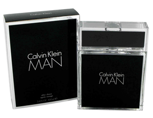 |
| Source: http://www.norcorp.com/Portals/60349/images//CK-Man-cologne-bottle.jpg |
Blue is an easy one. It conveys power or authority, calmness, success and trustworthiness. That's why most police uniforms are blue. And we see blue in the logos of many financial corporations. Let's take a look at Cirrus' blue logo for example:
| Source: https://encrypted-tbn0.gstatic.com/images?q=tbn:ANd9GcSig05WCre6WI5516_ONykYQnHzLAy_jZgCKI6mekj1fM7wZQ8T |
I wanted to see how many other financial insitutions have blue in their logo so I did a Google image search. Wow, look at all these logos with blue in it. Is this a trend I spot?
| Source: https://encrypted-tbn3.gstatic.com/images?q=tbn:ANd9GcSEyUSofLUl3G9vXMB29qcfWF_KwAbKeaDQmMoZb11BlJNQmMzeOA |
Ten out of the 12 above logos have blue in it. The only ones that don't belong to Discover. When looking at logos now, I will have a keener sense over the choices that designers make in the color, imagery, font, placement, etc. There is so much intention behind logos that make them so effective at, yes of course, manipulation!
Sources:
Meggs' History of Graphic Design
http://www.optimus01.co.za/psychology-logo-design.html
http://www.psychologytoday.com/articles/200805/logos-branded-life
No comments:
Post a Comment